Most people don’t spend much time contemplating ceiling paint color, choosing to focus on wall color instead. There is something to be said about ceiling color and what it can do for a room and a home overall.
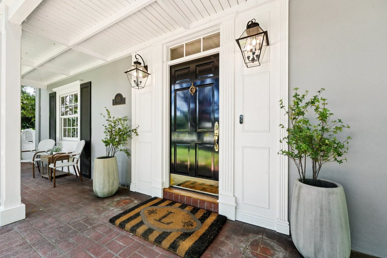
Probably 99% of homes have the same color on the ceiling as they do on the interior trim of the house, meaning doors, door trim, window trim, baseboards, and crown molding. This is a tried and true formula that works well and generally makes the ceiling a neutral object of the home. And that’s why you see it so often.
Many interior designers like to paint ceilings the same color as the walls but two shades lighter. A basic formula someone came up with at some point in the past, most likely because it works and it makes crown molding pop more than if the molding and the ceiling color are the same.
You may also see ceilings the same color as the walls so that the trim really stands out. This works best in rooms with 8 foot ceilings or higher. With bolder colors it works great in intimate spaces such as a dining room, library, study or powder room. It creates a rich look, and depending on the color, it can have quite a dramatic effect.
Since darker tones on a ceiling can make a room feel shorter, more closed in and smaller – which can be good in the spaces just mentioned above – in your average home with traditional 7 1/2 foot ceilings this may not be the best approach. Newer construction aims for 8 foot and up ceiling heights, so if your home is newer you’ve got an advantage when it comes to color.
What gets painted most often is just the walls, not the ceiling or trim.
When updating a home with new paint it is the wall colors that get changed the majority of the time. Trim will get touched up but rarely completely re-done because this saves money. In real estate, we do this all the time.
The ceiling is generally one of the last things people consider painting. And for good reason. It doesn’t get touched, a vacuum never scuffs it, kids don’t lean on it or rub their hands on it, pets can’t get near it. It generally stays just the way it was when it was originally painted except for the occasional ball bounced too high or worse, a water leak that needs patching or the addition or subtraction of a light fixture. When these larger events happen it is a great idea to have the ceiling redone however 9 times out of 10 it never gets redone and you can see the patch work when you look up.
The Pitfall of Just Painting the Walls
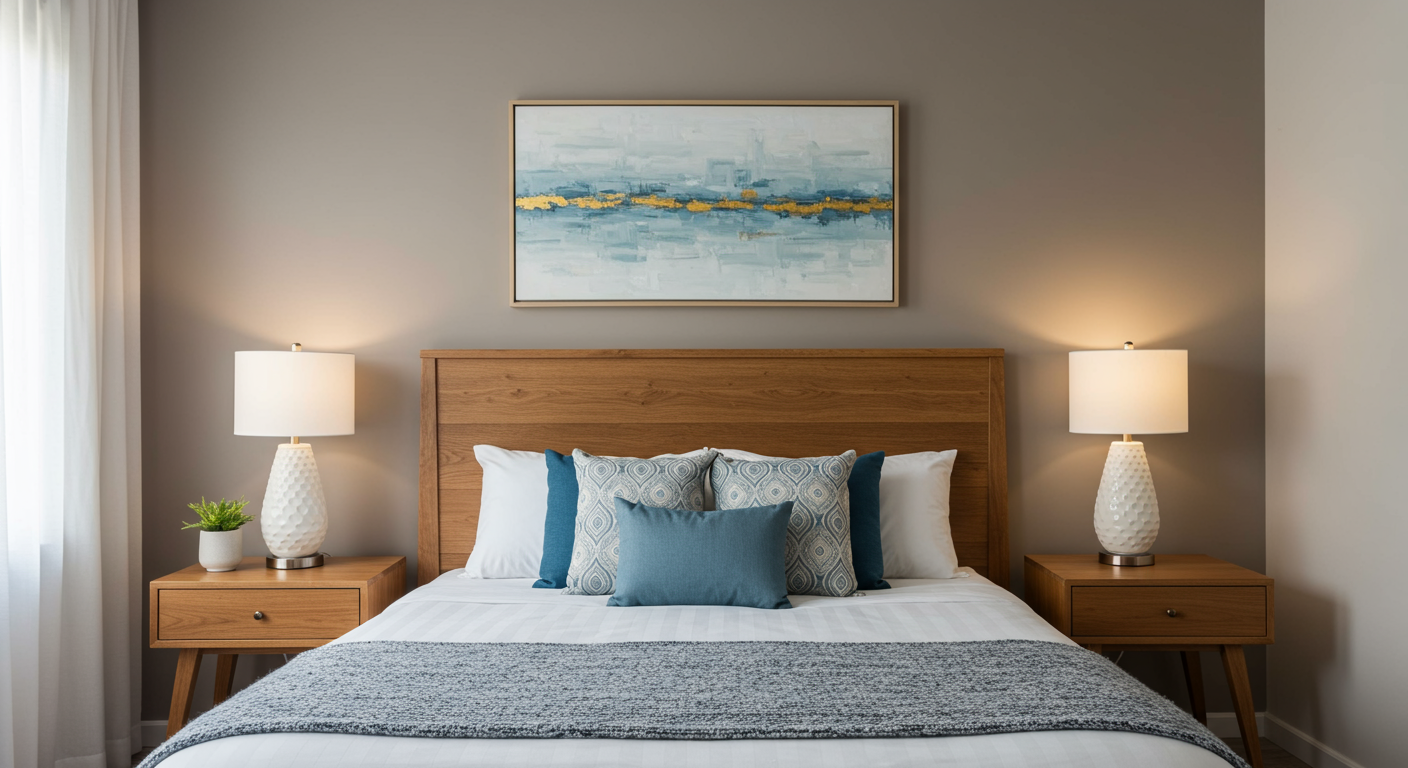
In real estate, when preparing a home to sell, we often change the wall colors to freshen up and update the look of the home. Gray and greige (greige = gray + beige) tones are in style, so a quick update is to move to those color schemes. Two of my favorites go-to’s have been Edgecomb Gray and Wise Owl, both by Benjamin Moore. I love these greige toned colors, Wise Owl being the darker of the two and registering well in rooms with more natural sunlight or spaces that can use a more formal look such as the entry way. They pair great with Swiss Coffee, the most commonly used trim and ceiling color known the man.
**Side note, there is a subtle difference between Kelly Moore and Benjamin Moore’s versions of Swiss Coffee so you may want to check the garage for the paint can label if you’re touching up trim.**
On a recent job, the walls were painted yellow and the texture on the walls was very rough. The homeowner said it was one of the worst mistakes they’d made and were more than happy to re-do the texture to help with the home sale. I chose Wise Owl in the entry way and the family room (sun-filled), and Edgecomb Gray for the living room. After it was painted the color was not popping like usual and the ceiling appeared dingy, which doesn’t suit any Realtor – we like clean and bright spaces. It was the curse of a trim color that was used broadly during a period of time in the 80’s. Frost. It sounds lovely, I agree. It was not lovely.
Lucky for me, while I am uber particular and notice the smallest of discrepancies, the average buyer is not. The home overall showed great, there was not a single negative comment about the spaces that had been painted. To my eyes they could have been brighter and popped more, to the buyers eyes it was a great family home in a great neighborhood that could use some updating but was overall move-in ready.
The lesson learned was to be sure to always check the ceiling and trim color with the wall color before anything hits the walls. Would I have chose differently if I had? I would have still stuck to a greige but gone with a different tone so that the walls popped more. It was still leaps and bounds better than the original condition.
Why Not Just Paint the Ceiling?
So why not then paint the ceiling to correct the look? Quite simply, the return on investment would not have been there. It costs more to paint a ceiling because it takes more care and prep. Additionally, it is not easy to do in a house that is occupied. Furniture, floors and walls must be covered and worked around. Generally speaking, when people are selling they are either living in the home or want it sold very quickly once they move out, and they want the highest return possible with the least amount of time and money put in. This is one of the reasons I caution buyers against purchasing flipped homes, but that’s a different topic in itself.
So now that the basics of ceiling paint are covered, what colors are the best choices when you are ready to paint the ceiling?
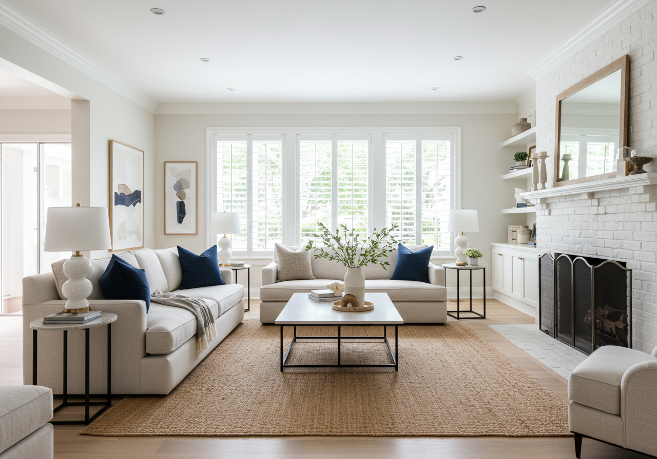
I always advise sticking with your trim color. Styles change over time, just like fashion, the decorating industry loves to change things up so that they can sell new product. If you go with the current trend in colors for your walls and your ceilings it will be more work, more mess, more cost to change later. If you stick with a basic ceiling color updating your home to the newest color trends is a snap.
So back to ceiling. What ceiling color am I loving right now?
On one of my current projects I veered from the tried and true Swiss Coffee to see what a brighter white would do to a home with traditional 7 1/2 foot ceilings. So far I am loving it. The color I chose is Opulant White. It does have undertones of pink though so be wise and choose your wall colors carefully.
For Bathroom Ceilings, Go Bolder.
For bathrooms, I like the look of ceiling and walls done in the same color. It gives a nice depth to a smaller space. This works well in a child’s bedroom too if you are looking to create a fun creative feeling in the space and works especially nicely on ceilings that are higher or vaulted.
Dining Rooms Deserve to Be Different
Same goes for dining rooms, I like the monochromatic look and the mood it creates in a dining room especially one with dimmable lighting. It can really amp up the formality or intimacy of a dinner party with softer lighting. If your whole color scheme is neutral and your floor plan is open this subtle difference from the rest of the house will likely draw people to this room – perfect for family time and gatherings – without standing out from the rest of the house. It’ll be so subtle guests won’t notice but the space will feel warmer.
Another Alternative Is Ceiling Treatments
Love them. Love when the eye is drawn to special features in a home that make it wonderfully unique from the cookie cutters we see day in and day out in real estate. And ceiling trimming can do this. Panels, beams, tiles, there are so many options, if you’re looking to expand your design elements and create a more personal space these are great options.